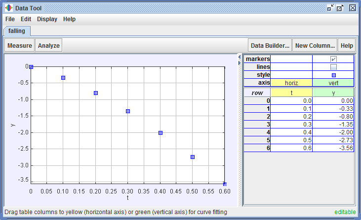
The Data Tool is an Open Source Physics (OSP) application that enables users to analyze data organized into table columns and displayed in named tabs as shown below. Data can be transferred directly from OSP applications like EJS and Tracker, imported from spreadsheets and other data sources via text files or the clipboard, or entered directly from the keyboard.
Tabs may be editable or non-editable. Both types of tabs provide the same plotting and analysis capabilities, but only editable tabs permit the user to enter or edit values in table cells. The editable status of a tab is indicated by a green "editable" or red "non-editable" label in the lower right corner of the tab.
You can make an editable clone of a non-editable tab by right-clicking the tab and choosing Clone Tab|Editable from the popup menu.
Data Tool works under Windows, OS X or Linux as long as Java 1.6 or later is installed. Note: Mac users, please substitute "control-click" for "right-click" to access popup menus.
This help file contains the following sections:
Entering data (editable tabs only). Click the New Column... button and enter a name in the popup dialog to create a new table column. The first cell in the column is automatically selected for data entry--simply type in a value (numbers only) and hit the enter key to move to the next cell. New rows are added as needed. Values may be entered in decimal form or in scientific notation using the letter E to mean "ten to the power of." For example, the number 345.6 may be entered as 345.6, 3.456E2, or even 3456E-1.
Importing data. Data can be imported from files, by pasting from the clipboard, or by direct transfer from other OSP applications. To import data from a file, choose the File|Open... menu item and select the file using the file chooser. To import data via the clipboard, first copy the data from the source application (spreadsheet, Logger Pro, etc.) and then choose either the Edit|Paste|New Tab menu item to open the data in a new tab or Edit|Paste|New Columns menu item to add the data to an existing tab. To transfer data directly from other OSP applications (Tracker, EJS, etc.) choose the popup "Analyze..." or menubar "Window|Data Tool" or "Tools|Data Tool" item in that application.
Refreshing OSP data (non-editable tabs only). Data transferred from Tracker and other OSP applications remains connected to its original source. If the source data changes (e.g., if a model parameter is changed), click the "Refresh" button to update the data in the Data Tool tab.
Editing cell contents (editable tabs only). Double-click a cell to edit its contents. The current contents (if any) are selected so that typing immediately begins a new value. While typing, the cell turns yellow to indicate the contents have changed. Hit the enter key to enter the new value and move to the next cell.
Sorting rows. Single-click a column header to sort the rows in ascending order of the values in that column. This is often useful for selecting a subset of cells whose values fall in a desired range. Single-click the row column header or double-click any column header to sort by row number.
Selecting cells. Multiple data points can be selected, and selected points are highlighted, in both the table and plot. To select cells in the table, click a cell with the mouse, or drag to select multiple cells. Control-click to add or remove cells from the selection, or shift-click to select all cells between the previous and newly clicked cell. To select points in the plot, click a point or drag the mouse to draw a rectangle and select the points inside. Control-drag to add points to the selection, or control-click individual points to add or remove them.
Selecting rows or columns. Double-click a row number or column header to select the whole row or column. Control-click to add or remove to the selection, or shift-click to select all rows or columns between the previous and newly clicked one. Double-click the row column header to select all cells.
Clearing the selection. Single-click any row number to clear the selection (i.e., deselect all cells). Note that clicking a column header does not clear the selection, but instead sorts the rows as described above.
Copying cell contents. Right-click a cell or group of selected cells and choose the popup Copy Contents item to copy the selected cell values to the clipboard. Right-click selected row numbers or column headers and choose the appropriate popup item to copy entire rows or columns. Copied contents are suitable for pasting into a spreadsheet or other application.
Deleting cell contents (editable tabs only). Hit the delete key to delete the contents of all selected cells.
Deleting cells (editable tabs only). Right-click a cell or group of selected cells and choose the popup Delete Cells item to delete them. Note: deleting a cell is not the same as deleting its contents. When a cell is deleted, it is removed completely from the table, and cells below it are shifted up (i.e., to lower row numbers).
Cutting cell contents (editable tabs only). Right-click a cell or group of selected cells and choose the popup Cut Contents item to cut the selected cell values to the clipboard. Cut contents are suitable for pasting into a spreadsheet or other application.
Cutting rows (editable tabs only). Right-click a row number and choose the popup Cut Rows item to copy the selected rows to the clipboard and remove the rows from the table. Cut rows are suitable for pasting into a spreadsheet or other application. Note: when a row is cut, rows below it are renumbered.
Inserting cells (editable tabs only). Right-click a cell or group of selected cells and choose the popup Insert Cells item to insert new empty cells. The existing (selected) cells are shifted down (i.e., to higher row numbers) to accomodate the inserted cells. Right-click selected row numbers and choose the appropriate popup item to insert new rows or to add an empty end row.
Pasting cells (editable tabs only). Right-click a cell or group of selected cells and choose the popup Paste Cells or Paste Insert Cells item to paste the clipboard contents. Pasting the cells replaces the current cell values, while paste-inserting inserts new cells and shifts the existing cells down (i.e., to higher row numbers). Right-click selected row numbers and choose the popup Paste Insert Rows item to paste-insert entire rows.
Copying or cutting columns. To copy or cut one or more table columns, select the columns, then right-click a column header and choose the popup Copy Columns or Cut Columns item. Cut columns are immediately removed from the table.
Cloning columns. To clone one or more table columns, select the columns, then right-click a column header and choose the popup Clone Columns item.
Renaming columns (editable tabs only). To change the name of an existing column, right-click the column header and choose the popup Rename Column... item. Column names must be unique and can contain no spaces. An underscore in a name causes subsequent characters to be subscripted.
Undoing edits. Choose the Edit|Undo or Edit|Redo menu item to undo or redo edits. There is no limit to the number of edits that can be undone.
Formatting columns. To control the number format of the data columns, right-click a column header and choose the popup Format Columns... item to display the Number Format dialog. In the dialog, select the names of the columns you wish to format. Use the shift and control keys to add or remove names from the selection. Enter the desired format into the format field to apply it to the selected columns. The sample field shows the result of the format applied to the number PI.
Typical number formats include (a) "0" for whole numbers only, (b) "0.000" for decimal numbers rounded to three places, (c) "0.00E0" for scientific notation with two decimal places, and (d) blank for default formatting. Trailing characters may also be used to show units.
Defining plot axes. The leftmost data column in the data table defines the independent variable plotted along the horizontal axis. The second leftmost column defines the principal dependent variable plotted along the vertical axis. The (x, y) points defined by these leftmost two columns are called the working data (see Analyzing Data) and are always visible on the plot. Other table columns are visible only when desired (see below), and are also plotted along the vertical axis.
To change the independent variable do one of the following:
To change the principal dependent variable do one of the following:
Setting plot visibility and styles. Controls to set the visibility and style of the point markers and connecting lines associated with table columns are displayed directly above the column names. Select the appropriate checkboxes to draw markers and/or lines for the desired column. Click the "style" cell to display a dialog for setting the shape, size and color of the markers and lines.
Scaling plot axes. The plot axes autoscale by default. There are several options for setting the horizontal and/or vertical scale manually:
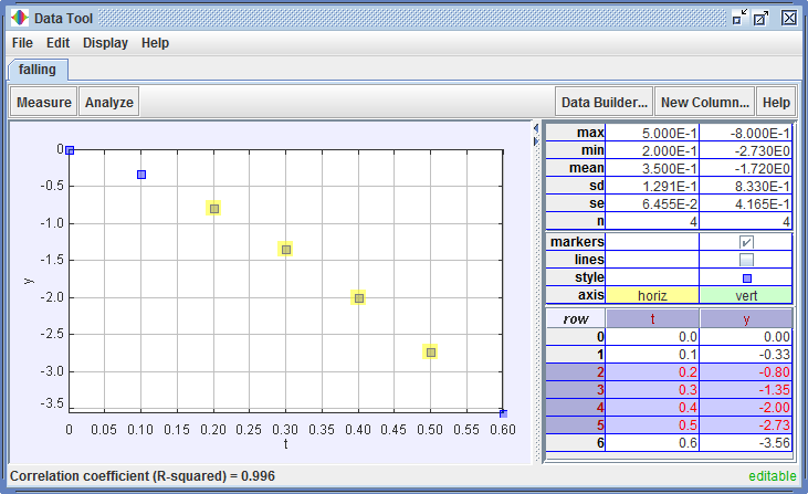
Displaying the statistics table. Click the Analyze button on the toolbar and check the Statistics checkbox to display statistical data for all table columns as shown in Figure 2. Statistical data include the minimum, maximum, mean, standard deviation, standard error and number of data points in the sample.
Selecting the sample data. Select a subset of points as shown in Figure 2 to restrict the statistical sample.
Defining the working data. The leftmost two data columns, identified by the yellow and green cells in the plot properties table, define the working data for analysis and curve fitting purposes. To change the working data, drag the headers of the desired table columns or click the axis labels and choose from the popup choices as described in Defining plot axes.
Measuring coordinates. Click the Measure button on the toolbar and check the Coordinates checkbox to automatically identify and display the coordinates of the working data point nearest the horizontal mouse position.
Measuring slopes. Click the Measure button on the toolbar and check the Slope checkbox to automatically display the slope line and value at the working data point nearest the horizontal mouse position. The slope approximates the derivative of the curve connecting the working data points.
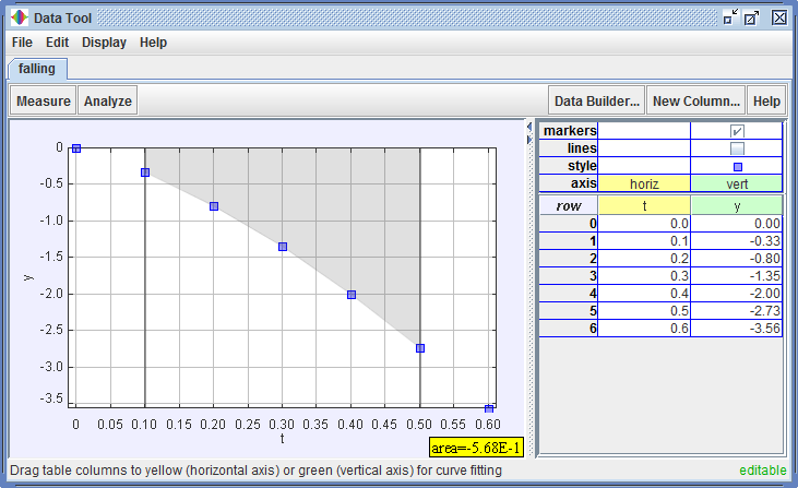
Measuring areas. Click the Measure button on the toolbar and check the Area checkbox to automatically display the area between the working data and the horizontal axis within adjustable upper and lower limits. Areas, drawn in a gray shade, are positive above the horizontal axis and negative below the axis. The area approximates the integral under the curve connecting the working data points.
To adjust the upper and/or lower limit, move the mouse over the limit line until a double-ended arrow appears as shown in Figure 3, then drag left or right.
Selecting the fit data. The curve fitter fits a mathematical model to the selected working data. To change the working data, drag the headers of the desired table columns into the leftmost (yellow and green) positions or click the axis labels and choose from the popup choices as described in Defining plot axes. To further refine the curve fitting process, select a subset of points. Only the selected points are included in the fit.
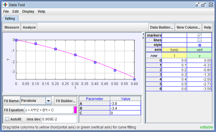
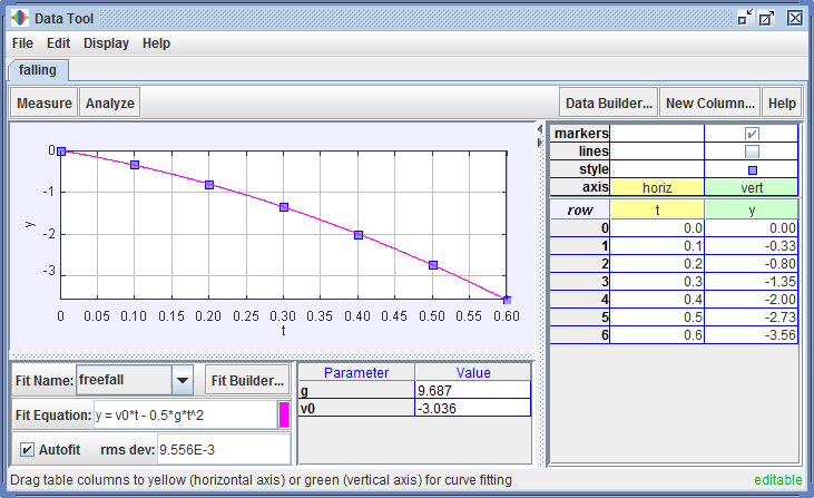
Displaying the curve fitter. Click the Analyze button on the toolbar and check the Curve Fits checkbox to display the curve fitter as shown in Figure 4. The curve fitter draws an analytical fit function on the plot and determines the rms deviation between the fit function values and the vertical working data values (green column, selected rows). Typically, a fit is optimized by varying parameters of the function to minimize the rms deviation, which is displayed in a field near the bottom.
Selecting the fit function. Select a fit name from the dropdown list. The fit function equation is displayed in a field and the function parameter names and values are listed in a table.
Setting the fit color. The color of the fit line drawn on the plot is displayed on a small button to the right of the fit equation field. To change the fit color, click the button and choose a color from the color chooser.
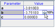
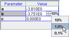
Adjusting fit parameters. To vary a parameter, click in its value cell as shown in Figure 5. Type in a new value, or use the up and down arrow buttons to increase or decrease the parameter value in increments equal to a fixed percent of its starting value. To change the increment size click the percent display and select from the popup choices.
![]()
Using autofit. Click the Autofit checkbox to automatically optimize the parameters. Note: for most custom fit functions (see below), parameters must be manually set to reasonable starting values before autofitting.
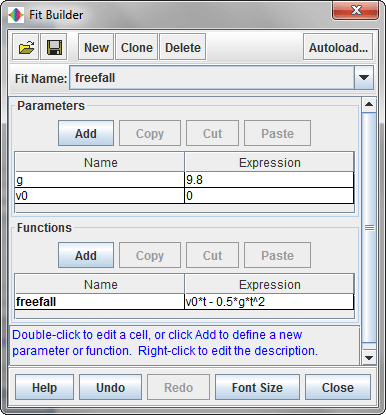
Defining custom fit functions. Click the Fit Builder button to define a custom fit function using the Fit Builder as shown in Figure 6. Define parameters for the function, change parameter and function names, and enter parameter and function expressions as desired. Complete help for the fit builder is available from the Help button in the fit builder itself.
Once a custom function has been defined it is available by name from the dropdown list and behaves in all ways like the built-in functions (i.e., parameters may be adjusted or autofit as described above).
Fourier analysis is the representation of an arbitrary function as a sum of sines and cosines. Data Tool implements a Fast Fourier Transform (FFT) that converts a set of data with equally spaced x-values (often time) to a frequency spectrum that shows the amplitude of the sine component, cosine component and power as a function of frequency.
Displaying the Fourier spectrum. Click the Analyze button on the toolbar and check the Fourier Spectrum checkbox to display the Fourier spectrum of the working data as shown in Figure 8.
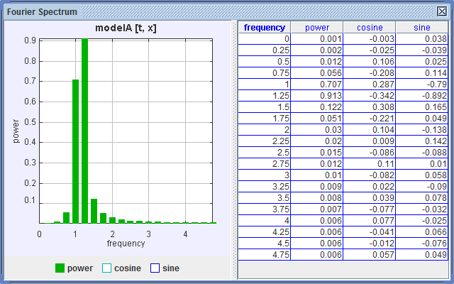
Plot variables. Power versus frequency is plotted by default. Click the checkboxes below the plot to change the plot display.
Working data requirements. The Fourier spectrum is only meaningful if the working data (source) has equally spaced x-values. The spectrum is "live" and updates itself automatically when the working data changes (by, for example, selecting a subset of the source data or dragging a new data column to the green vertical-axis position).
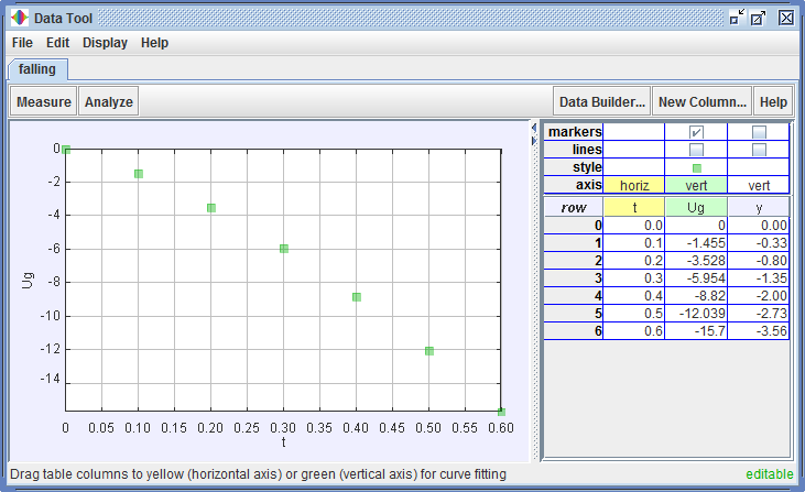
Displaying the data builder. Click the Data Builder button to display the Data Builder shown in Figure 9. The data builder enables users to define new data columns that are functions of existing columns.
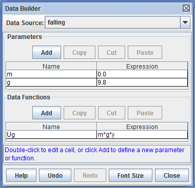
Defining data functions. Click the Add button in the "Data Functions" section to define a new data function. The data function column is immediately added to the table as shown in Figure 10 and becomes available for plotting, fitting, or as input to other data functions. Define parameters for the function, change parameter and function names, and enter parameter and function expressions as desired. Complete help for the data builder is available from the Help button in the data builder itself.
Saving tabs. Choose the File|Save Tab or File|Save Tab As... menu item to save the currently selected tab as an xml file. Saving a tab includes not only all data columns, but also the column visibility and styles, custom data functions, fit functions and parameter values, etc. To open a saved tab, choose the File|Open... menu item.
Exporting data. Data can be exported to a file or to other applications via the clipboard. If any table cells are selected, only those cells will be included in the exported data. To export data to a file, choose the File|Export Data... menu item and save the file using the file chooser. To export data via the clipboard, copy the data using either the Edit|Copy|Data menu item or by right-clicking the table as described above, then paste into the target application (spreadsheet, etc.).
Exporting images. Choose the Edit|Copy|Image menu item to copy an image of the currently selected tab, then paste the image into a target application (word processor, etc). This is useful for lab notes or other documentation where the plot and/or fit results are needed.